
Published on October 14, 2025 5:20 PM GMT
So, as regular readers may recall, I like to look at color trends in fashion quantitatively. It’s a quixotic little hobby, but it’s mine (and, strangely, I have never seen anybody else do it.)
It’s also a nice little occasion to reflect on the passage of time, pick a theme for the year ahead, and suchlike personal meditations.
Past posts: FW25, SS25, FW24, SS24.
Methodology Recap
Designer fashion collections are released several times a year, but the ones I track are spring/summer and fall/winter ready-to-wear, which come out in fall and spring respectively. Twice a year there’s essentially a fashion industry trade fair lasting several weeks — New York Fashion Week, London Fashion Week, Milan Fashion Week, and Paris Fashion Week.
These are for both men’s and women’s clothes (or unisex; lines are blurred these days), but generally slant female; there’s a separate menswear season that I don’t track.
Vogue Magazine generously hosts a lot of free images of these fashion collections; this season there were over 13,000 pictures.
This year I did both manual counts, where I counted how many “looks” a given color (as subjectively determined by me) appeared in, and automated counts, where I asked an LLM (currently GPT-4o) to identify all the colors in the outfit in each image and aggregated the counts across images. I’m using the same code and prompt as I have for the past several years for the automated counts.
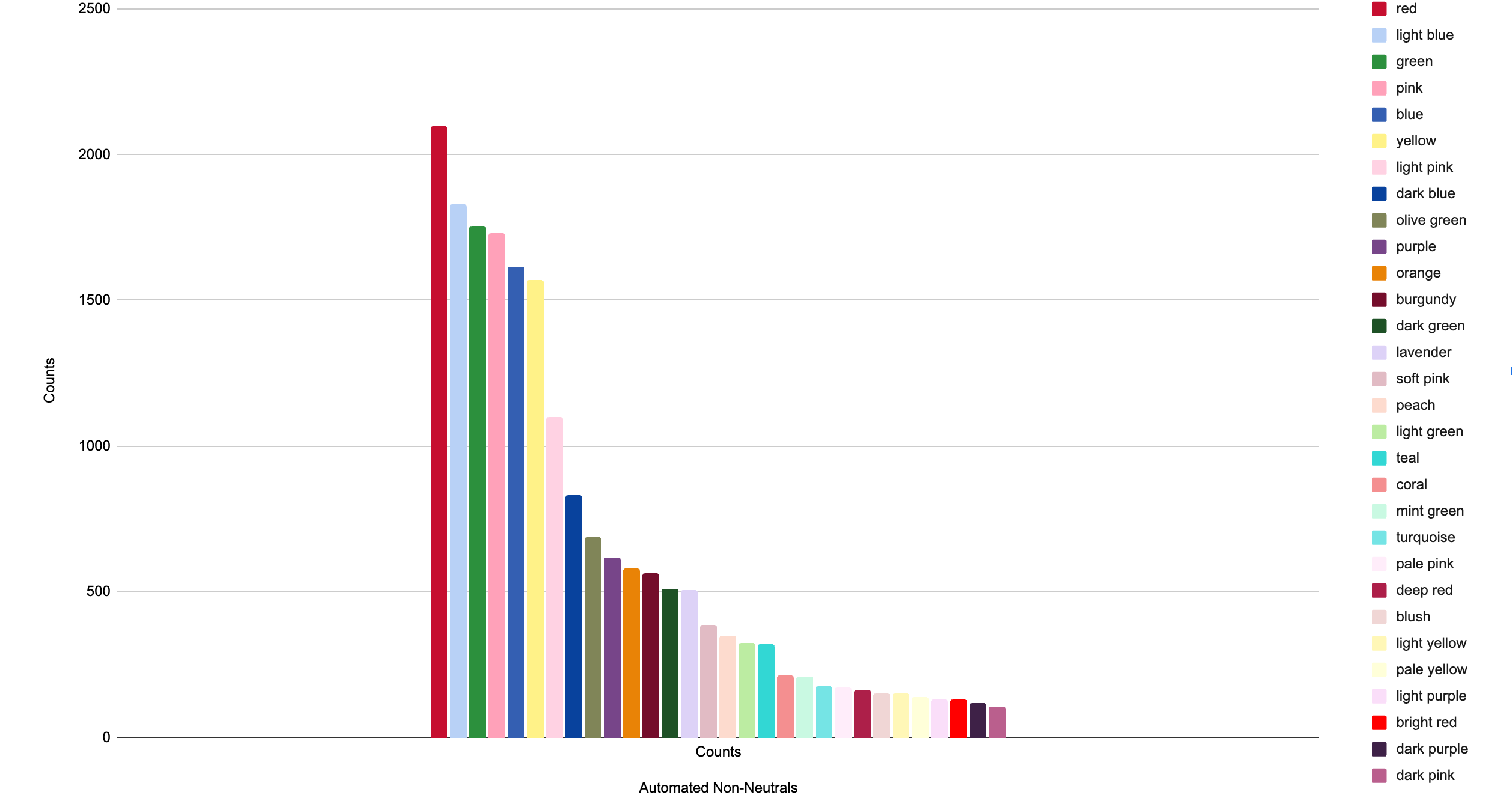
As in past seasons, I only manually count non-neutral colors (=not black, white, gray, brown, beige, etc) in order to save time; automated counts include neutrals and non-neutrals.
There are a couple reasons why manual and automated counts might diverge:
Color lumping/splitting effects; for instance, LLMs tend to lump many shades of green into the word “green” while I differentiate more finely, leading to the LLM scoring green as more common than I do.
This tends to bias the automated counts towards more general color categories vs. the manual counts.
Repetition effects; the LLM will often repeat a color name multiple times per image, for instance if there is a red belt and red shoes that might be counted as two instances of red, whereas I’d manually count that as one instance of red.
This will tend to bias automated counts towards colors that appear more in accessories; it also just adds noise.
Ambiguous cases; e.g. I might identify a color as khaki that the LLM considers olive green.
This just adds noise, except to the extent that LLMs have a systematic color categorization bias. (They do seem to be slanted towards greens and purples, in my experience.)
Synonym effects; the LLM may separately count “gray” and “gray”, or “light” vs “pale” vs “pastel” shades of a color.
This will lead to biasing automated counts to lower counts but more different instances of synonymous or nearly-synonymous colors.
Results
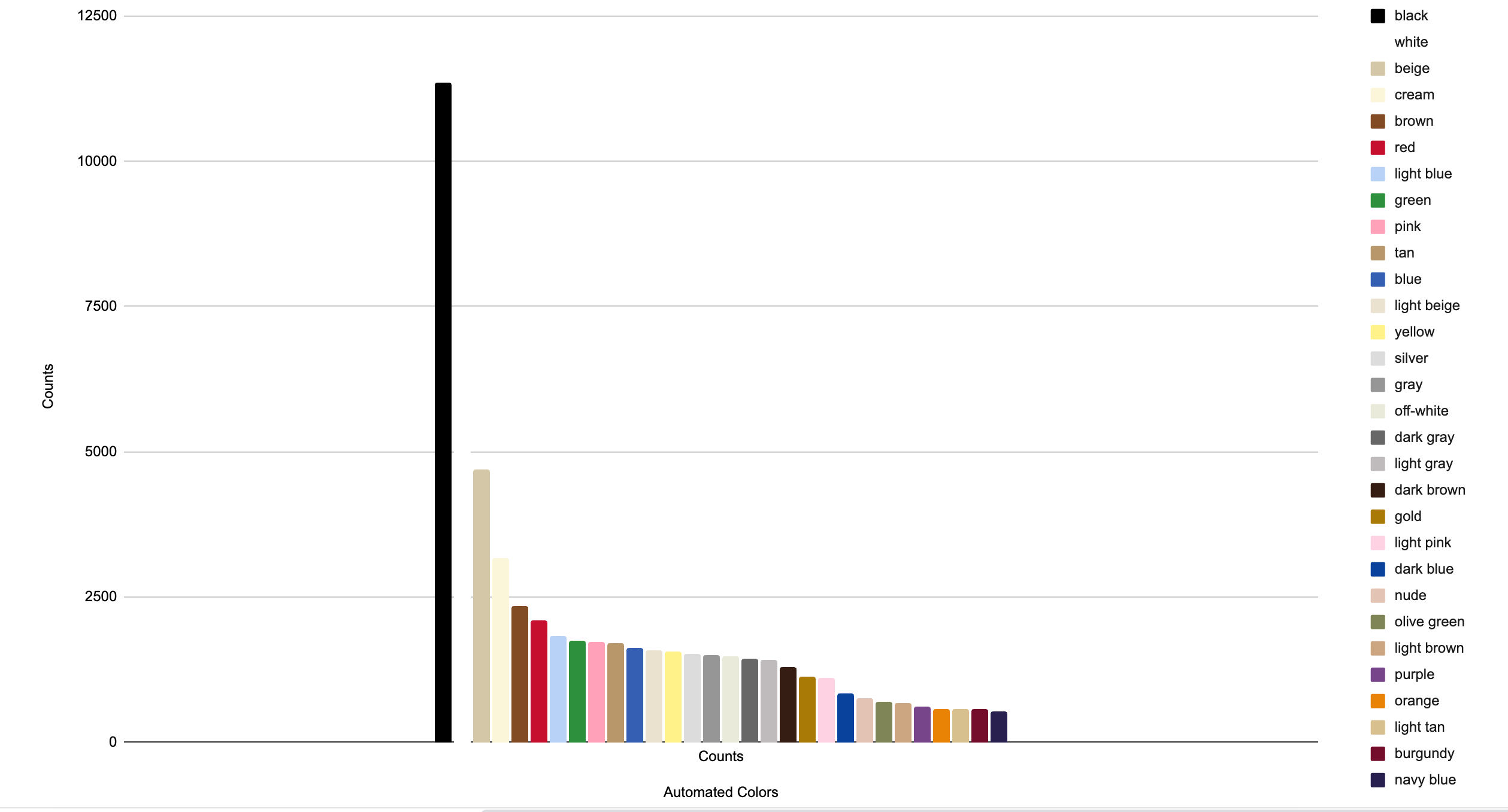
As in previous years, we see black, white, and other neutrals top the chart, and red is the top non-neutral color.
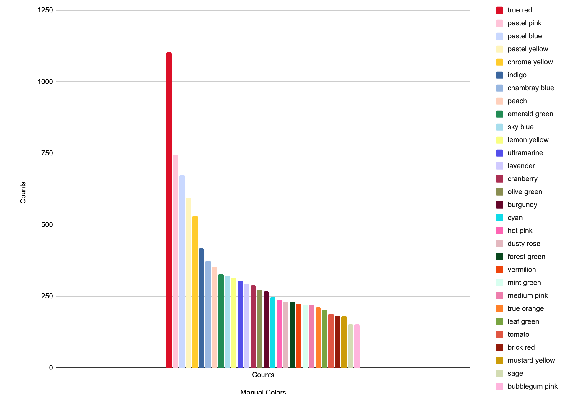
What especially pops out in the manual color counts is the prevalence of pastel yellow, right after perennial classics like red, pastel pink, and pastel blue:
In fact, if you compare to last year’s spring season (SS25), you see a systematic movement towards soft pastels and away from brighter shades.
Rising (significantly higher in rank than last year):
pastel yellow (#29 → #4, manual)
lavender (#26 → #13, manual)
tan (#21 → #11, automated)
New (in the top 30 this year but not last year):
light tan (automated)
dusty rose (manual)
coral (automated)
blush (automated)
medium pink (manual)
dark pink (automated)
brick red (manual)
mustard yellow (manual)
mint green (manual)
sage (manual)
light purple (automated)
dark purple (automated)
Falling (significantly lower in rank this year than last year):
hot pink (#9 → #18, manual)
bubblegum pink (#17 → #30, manual)
true orange (#12 → #25, manual)
Lost (in the top 30 last year but not this year):
ivory (automated)
dark red (automated)
coral pink (manual)
spiced orange (manual)
tangerine (manual)
mustard yellow (automated)
lime green (automated)
medium blue (automated)
Dutch blue (manual)
royal blue (automated)
Or, visualized, you can see that there are a lot of muted, coolish, pale shades among this year’s winners, and hot, bright colors among the losers:
Economic Trends
To the extent that there are recurrent themes in the SS26 season, we’re looking at pastels, preppiness, and generally cautious/conservative choices; these are both visible to me and echoed in Vogue’s editorial coverage.
It makes sense that the fashion world would pull back from the edge; these are bad times for the luxury goods market.
2024 saw total luxury goods spending down 2%, with many brands seeing profit drops:
The final 2025 numbers aren’t in (and preliminary numbers are not representative because Christmas-season purchases are so big a percentage of the whole) but this is expected to be a weak year too, particularly because of tariffs in the US and the real estate bust in China.
When consumers pull back on luxury spending, fashion collections tend to reflect a swing “back to basics” — safer choices, less eccentricity. We are definitely not in the post-pandemic spending boom of 2021 when wacky, tropical-hued party clothes were ascendant. We’re also not seeing a lot of explicit political-statement collections, despite the Trump presidency; if anything, the fashion world seems to be in retreat from current events.
My Pick For 2026 Color Of The Year: Pastel Yellow

Pastel yellow is the most unobtrusive of the pastels. It’s a gentle, mild, fluffy color; think daffodils, baby chicks, fresh butter, warm sunshine.
If pastel pink evokes a romantic ingenue protagonist, then pastel yellow is the “supportive best friend” side character. Grounded; cheerful; not calling attention to itself.
The whole pastel range, from pink to peach to mint green to pastel blue to lavender, makes a strong showing in the SS26 collections, but pastel yellow is the biggest “winner” in this year relative to past years, mostly in classically feminine and preppy contexts.
We see it paired with other pastels:
balanced with neutrals:
complemented with pops of color:
or all by itself in a head-to-toe flow:
Pastel yellow is peaceful, restful, hopeful.
It’s not the abstract, contemplative, distant-skies calm of pale blue (which was my pick for 2023’s color). Pastel yellow belongs to the earth; its peacefulness is material. The comfort and contentment of butter and flowers and sunshine. Mellow yellow.
Unlike the spiky freshness of spring green (my pick for 2024) or, even more so, the frenzied fun of hot pink (my pick for 2025), pastel yellow isn’t trying to be even a little bit edgy or intense. It’s soft and slow-paced; it lends itself easily to touchable textures and a buttery, sunlit feeling of indulgence in the senses.
Looking Forward and Back
Since I’ve been doing these fashion stats projects, I’ve used the “color of the year” as a sort of theme to inspire me in the year to come.1
2023: Sky Blue/Spaciousness
This was a year when I was kind of coming out of a turbulent phase of being dissatisfied with the work and family responsibilities of a thirtysomething, and just starting to get into a set of habits that were more functional and “wholesome”. My goal was to “make space” — have enough time for myself as well as have a calmer outlook on life.
That basically worked, I think. If you look over my 2023 blog posts, that was when I was starting to get more interested in LLMs and in neurotech. In my work life, I was learning a bunch of new skills on the “business side” (marketing, financial analysis, sales process optimization, etc) and starting to get the hang of adding value, and at home, things got into more of a rhythm as my older kid started school and learned to read.
2024: Spring Green/Freshness
My theme for 2024 was about “poking my head out from under a rock”, trying new things, looking for aliveness and newness.
Well, I did that, pretty much: full-time writing/consulting was new to me, as was some of the playing around with LLM wrappers and finetunes I tried out, and scientific program management (as a fellow at Renaissance Philanthropy.)
2025: Hot Pink/Fun
My theme for 2025 was “fun”, to match the raucous energy of hot pink.
Now, I really don’t have a wild-party life these days, and I also got pregnant with kid #3, so “fun” in that sense wasn’t really the most practical for me. But I did have fun in the sense of getting opportunities to travel and time for personal projects (during my freelancing/consulting periods), and the biggest positive step change in my overall mood I’ve ever experienced (thanks to an effective antidepressant.)
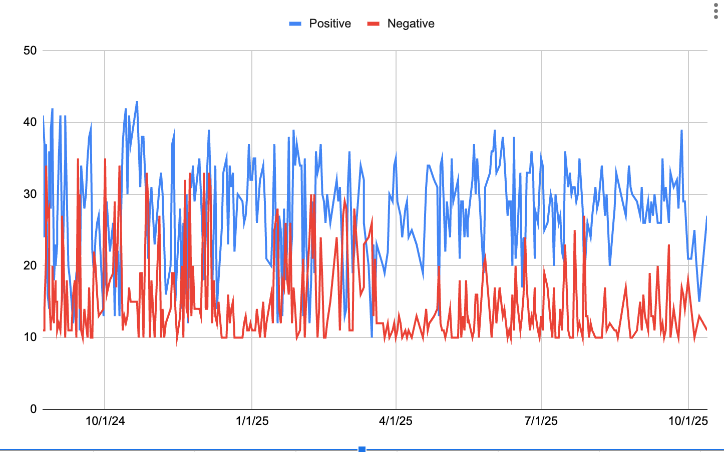
Seriously, check out this PANAS score graph and how negative affect just plummets in spring 2025 and mostly stays way down from the previous baseline. If not “fun” exactly, then definitely 2025 was a banner year for happiness.
2026: Pastel Yellow/Optimism
I don’t expect 2026 to be especially slow, easy, or mellow, what with a new baby and the prospect of some new work adventures. And I don’t particularly like the “mentally escape from the troubled state of the world” theme.
So I think I want to emphasize the cheerful side of pastel yellow, and its groundedness; taking small, steady, real steps in a positive direction. Adding up to something. Finding enjoyment along the way.
Do I actually wear the color in question? Not necessarily; for the past several years my “top pick” hasn’t been a color that flatters me.
Discuss
